Have you ever wondered: how to make orange paint at home? Unlocking the secrets to creating vibrant orange paint requires a keen understanding of color mixing and a bit of experimentation.
This guide will reveal the essential steps and techniques needed to mix various shades of orange right at your crafting station. Whether you’re a beginner or a painting enthusiast, you’ll discover how to mix colors effectively and learn the tricks to make a deep orange color perfect for your artistic projects.
By the end of this section, you’ll be prepared to delve deeper into the colorful world of paint mixing, ready to explore the nuances of color theory, mix your own orange paint, and bring your creative visions to life.
Understanding Color Theory

Grasping the intricacies of color theory is paramount in creating the perfect shade of orange paint. By understanding the color theory basics, you can better manage hue adjustments, color saturation techniques, and paint value scales effectively. This knowledge sets the stage for successful paint mixing, enabling you to achieve the ideal orange shade for your projects.
Hue, Saturation, and Value
Hue, saturation, and value are the fundamental components defining a color’s overall appearance. The hue refers to where a color lies on the color wheel. Hue adjustments can drastically change the perception of color, making it warmer or cooler. Saturation involves the intensity or purity of a color; mastering color saturation techniques can help you achieve vibrant or subdued shades. Finally, value refers to the lightness or darkness of a color, a crucial aspect when working with paint value scales to add depth and dimension to your work.
Primary and Secondary Colors
Identifying the differences between primary and secondary colors is essential for effective paint mixing. Primary colors—red, yellow, and blue—serve as the building blocks for creating a multitude of other colors. When these are mixed, they produce secondary colors: green, orange, and violet. Understanding the relationship between primary and secondary colors on the color wheel allows you to visualize and execute the creation of the ideal hues for your projects. This foundational knowledge will enable you to make more informed decisions in your color mixing adventures.
Basics of Mixing Orange Paint
Learning the basics of mixing orange paint is crucial for achieving vibrant and consistent colors. This section will guide you through the necessary materials and techniques to create the perfect shade of orange.
Required Materials
- Pigments in Primary Colors: Essential for creating a wide range of hues.
- Paint Mixing Tools: Include palettes and brushes for effective blending.
- Mediums: Used to adjust the consistency of the paint.
- Beginner’s Guide: Emphasizes starting with high-quality basics to ensure successful results.
Mixing Techniques
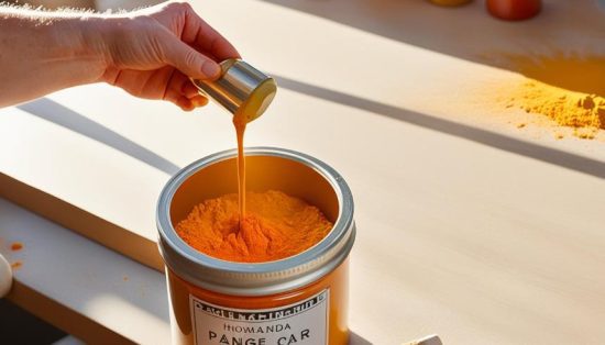
Effective methods for mixing paint colors involve both traditional and modern approaches. Using a palette knife or a brush, blend your red and yellow pigments carefully to achieve a uniform orange. Consistency is key in DIY paint mixing, as it ensures that the resulting color is smooth and even. Modern tools can also aid in this process, making it easier to replicate and refine your desired hue.
How to Make Orange Paint?
Creating the perfect orange paint involves a blend of basic yet precise steps. By starting with primary colors and making fine adjustments, you can achieve a myriad of orange shades for any artistic project.
- Combining Red and Yellow; The foundation of how is orange colour made naturally lies in the correct combination of red and yellow. Begin with equal parts of red and yellow paint on a palette. Mix them thoroughly to produce a standard orange hue, adjusting the ratio if necessary to achieve your preferred base shade.
- Tweaking the Hue; Once you have your base orange, tweaking the hue is key to achieving the desired intensity. If you’re wondering how to make orange red, simply add more red to your mixture incrementally. On the other hand, increasing yellow will give you a lighter, more vibrant orange. Experimenting with small amounts will help you find the perfect hue.
- Adjusting Saturation and Value; Beyond hue, adjusting saturation and value is essential for mastering your orange shades. To decrease saturation, mix in white or black paint cautiously. Adding white will create a pastel or tint, while black will result in a deeper, more subdued tone. Adjusting these variables helps you achieve the perfect balance and depth for your artistic needs.

Types of Orange Shades and Their Uses
Exploring an extensive palette of orange shades opens up numerous possibilities for any creative project. The myriad of orange shade varieties includes hues ranging from the highly saturated, lively oranges to more subdued, muted tones, and the sophisticated, greyed versions. These different shades have distinct applications and can significantly impact the outcome of an artwork or design. Understanding the application of different orange tones will help you select the perfect shade for your intended effect.
Vivid Oranges
Vivid oranges are characterized by their bold and intense hue, making them ideal for creating eye-catching and energetic compositions. These shades are often used in advertising and branding to attract attention and evoke feelings of excitement and enthusiasm. When incorporating vivid oranges into your work, consider their powerful visual impact and use them to highlight focal points or add vibrancy to your piece.
Muted Oranges
In contrast, muted oranges offer a more understated and soft appearance. These tones are created by adding complementary colors, which subdue the brightness of the original orange. Muted oranges are perfect for achieving a more subtle and refined look in your designs. They are frequently utilized in interior design and fashion to create a warm and inviting atmosphere without overwhelming the viewer.
Greyed Oranges
Greyed oranges, which are tinged with grey, exude a sophisticated and elegant charm. This type of orange is often used to convey a sense of maturity and calmness. Artistic uses of orange shades in this category include fine art paintings, where the complexity of the hue can enhance the depth and richness of the work. Choosing a greyed orange for your rooms can add layers of meaning and texture, making it a versatile addition to your color palette.
Using Different Pigments
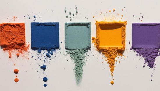
When it comes to creating vibrant orange hues, understanding the various types of pigments is crucial. By exploring both natural and synthetic pigments, you can achieve a range of effects and intensities. Natural pigments, such as those derived from iron oxide clays, offer earthy tones and historical authenticity. Synthetic pigments, like cadmium and ultramarine, provide bold, bright options for a striking appearance.
The choice between natural and synthetic pigments depends on your project’s requirements and desired outcomes. Combining different pigments can help you create unique and customized shades of orange. Experimenting with various pigment combinations can reveal how to make a deep orange color that stands out in your artwork.
Understanding the properties of different pigments allows you to manipulate their interactions and create a spectrum of orange shades. Whether you aim for the warmth of a sunset or the rich hue of autumn leaves, your knowledge of pigment types will enable you to make nuanced and compelling choices in your painting projects.
Effects of Opacity in Paints
Understanding paint opacity is crucial for mastering both the nuanced and bold aspects of your artwork. The distinction between transparent vs opaque pigments can significantly affect the final appearance of your orange hues. Transparent pigments allow light to pass through, ideal for painting with translucent colors, creating depth and luminous effects. Conversely, opaque pigments block light, offering solid paint coverage and a more vivid finish.
To achieve a balanced composition, you can strategically layer transparent and opaque pigments. This technique enables you to build luminosity through transparent layers and enforce boundaries or highlights with opaque strokes. Artists often employ this method to create a dynamic range of orange shades, from subtle tints to robust, eye-catching tones.
How to Test Your Mixed Oranges?
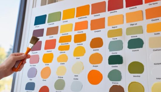
Testing your mixed oranges is a crucial step to ensure that your paint achieves the desired hue and consistency. To begin, create a color chart that allows you to visually compare various shades. This chart will serve as a reference guide for future projects and help you identify any adjustments needed for perfecting your mixtures.
Creating and Using a Color Chart

When testing paint colors, start by preparing a clean, white surface where you will apply small swatches of each mixed orange hue. Label each swatch for easy identification. This process, known as color chart creation, offers a side-by-side comparison of your paint shades, illuminating differences in saturation, value, and overall tone.
Documenting your color mixing experiments on a chart not only helps in replicating successful shades but also provides a visual reference when deciding on the right paint for a new project. Make sure to let each swatch dry completely, as colors can shift slightly upon drying.
Practical Application Tips
Beyond creating a color chart, it’s essential to employ effective paint application techniques to fully understand how your mixed oranges will behave on different surfaces. When painting on textured surfaces, observe how the paint interacts with the material’s texture. Techniques such as layering and blending can vary greatly depending on the texture, revealing the true quality and versatility of your mixtures.
Additionally, consider testing your mixed oranges under different lighting conditions. Natural light can drastically alter the appearance of a color compared to artificial light. By gaining insights from practical application, you can fine-tune your mixtures to achieve the best possible outcome, ensuring your orange hues are perfect for your project.
The Beauty of Home: Painting with Shades of Orange
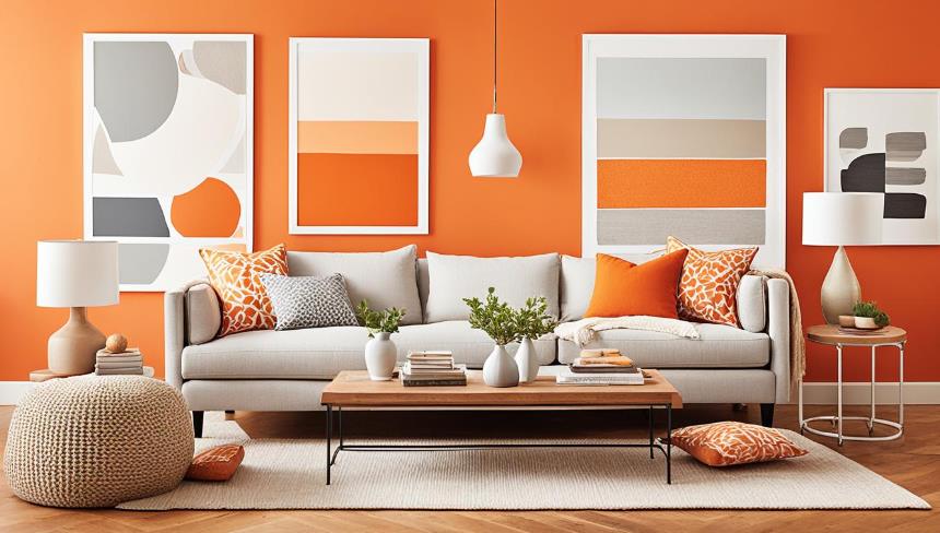
Incorporating shades of orange into your home can transform the atmosphere, bringing warmth, energy, and a welcoming glow to your living spaces. The beauty of orange lies in its versatility and ability to evoke various moods, from vibrant and lively to serene and sophisticated.
Orange is known for its warm and inviting qualities, making it an excellent choice for living rooms, dining areas, and entryways. A vivid, bright orange can invigorate a space, making it feel cheerful and energetic—perfect for rooms where you entertain guests or want to create a lively ambiance. For a more subtle and cozy effect, muted or greyed orange shades can add sophistication and calmness.
Orange hues can enhance natural light, making spaces feel more open and airy. In rooms with abundant sunlight, painting walls with soft, warm oranges can amplify the light, creating a sunny and welcoming environment. The reflective quality of these shades can make smaller rooms appear larger and more inviting.
One remarkable aspect of orange is its versatility in home decor. It pairs well with a variety of colors and styles. Combining orange with neutral tones like beige, white, or grey can create a balanced and harmonious look. Alternatively, pairing orange with complementary colors such as blue or green can add a dynamic and modern touch to your decor.
FAQs about Painting with Shades of Orange in Your Home
1. How do I choose the right shade of orange for my space?
Choosing the perfect shade of orange will depend on the mood and atmosphere you want to create. For a vibrant and energetic feel, select for bold, vivid oranges. These work well in social spaces like living rooms and dining areas. For a more relaxed and sophisticated look, choose muted or grayed oranges, ideal for bedrooms and reading nooks. Consider the natural light in the room, as lighter shades can amplify brightness, while darker hues add warmth and coziness.
2. How can I incorporate orange into my home decor without overwhelming the space?
Introducing orange into your home decor can be manageable. Start with accent pieces like orange throw pillows, rugs, or artwork hangings to add pops of color. You can also paint or design an accent wall in a complementary shade of orange. By pairing orange with neutral tones like beige, white, or grey, you can achieve a balanced look. For a more dynamic touch, consider complementary colors like blue or green. This approach allows you to enjoy the vibrancy of orange without it dominating the entire room.
3. What are the psychological benefits of using orange in home decor?
Orange is more than just a color. It’s a gateway to feelings of happiness, creativity, and warmth. It can stimulate conversation and social interaction. The warm tones of orange evoke a sense of comfort and security, enhancing the overall ambiance of your home. Using orange in your decor can create an inviting and uplifting environment, promoting a positive and welcoming atmosphere for you and your guests.

